Tape Over Half Your Website. Seriously.
"Simplicity in navigation isn't laziness - it's mastery."
— Chief Pulp Remover, Bureau of Unnecessary Clicks
Recently, a picture went viral on LinkedIn: a TV remote with almost all buttons taped over. Only power, volume, and channels remained.
Looks absurd? Maybe.
Works perfectly? Absolutely.
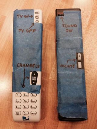
This image stuck in my head because every day I see websites that need the same tape treatment. A lot of tape.
Two books everyone who builds websites should read
Before diving into details, I want to mention two things that shape my approach to web development:
"Don't Make Me Think" by Steve Krug - the usability bible. The main idea is simple: every decision you force users to make is cognitive load. People don't want to think. They want results. Yesterday.
The KISS Principle (Keep It Simple, Stupid) - the simpler the system, the more reliable and understandable it is. This applies to code, design, and especially navigation.
And if you want practical design chops to back up these principles, check out Refactoring UI by the Tailwind CSS creators. It's packed with actionable tips that turn "I know something's off" into "I know exactly how to fix it."
Keep these ideas in mind. It'll make sense why soon.
Mega-menus: when "show everything" means "hide what matters"
I understand where mega-menus come from. I really do.
A company has 47 products, 12 industry solutions, a blog, knowledge base, careers page, and an investor relations section. Marketing wants everything accessible "in one click." Logical? At first glance - yes.
And so navigation transforms into an encyclopedia with dropdown panels, tabs within tabs, and icons meant to "help users navigate."
Yes, there are beautiful mega-menus. With images, clear hierarchy, where it's intuitive where to click. I've built some myself and I'm proud of a few.
But let's be honest: in most cases, mega-menus are link dumps with complex names that even company employees don't always understand. "Integrated Solutions Platform" - what even is that? "Enterprise Resource Hub" - and that?
A user opens the menu, sees 40 items, and one of two things happens in their head:
- Panic and closing the menu
- Frantic search for something familiar
Neither leads to conversion.
Don't believe me? Take a look at the navigation on Wiz, Deel, or Rippling. These are billion-dollar companies with world-class design teams. And yet their menus feel like choose-your-own-adventure books where every path leads to more choices.
To be clear: I genuinely admire the visual design of these sites. The menus are beautifully crafted, the typography is on point, the animations are smooth. But beautiful doesn't mean usable. It reminds me of King's Quest - a game I love dearly, but one where you need to solve puzzles just to move forward. Great for adventure games. Not great for finding your pricing page. Navigation should be point-and-click, not point-and-puzzle.
Here's the irony: click on any of their paid ads, and you'll land on a beautifully clean landing page. Just a logo, a headline, and a CTA. No navigation maze. No 47 dropdown options. Marketing teams know that when they're paying per click, every distraction costs money. So they strip everything away.
But the main website? Apparently, organic traffic is free to get lost.
Mobile navigation: a special circle of hell
Know what's worse than a bloated mega-menu on desktop?
When that same "full" navigation gets crammed into the mobile version.
A 6-inch screen. User holding the phone with one hand on the subway. And they're expected to open the burger menu, then expand a nested list, then another one, and somewhere on the third level of nesting find the pricing page.
Research (and common sense) shows: users almost never use mobile menus. Especially sticky headers that cling to the top of the screen and eat up precious space.
People scroll. People use search. People google "[company name] pricing" instead of looking for it in your menu.
But they DON'T open your burger to complete a quest through three levels of navigation.
Here's what that quest looks like in practice:
Accordions, sliders, and carousels: modern fine print
Remember how shady salespeople used to hide important terms in fine print in contracts? Hoping the buyer wouldn't notice and would sign.
Now we have more elegant tools: carousels, accordions, tabs, sliders. Looks modern and beautiful.
Works exactly the same - users don't see what they need.
Carousel statistics are brutal: the first slide gets most clicks, the second - significantly fewer, third and beyond - almost zero. Years of intrusive ads have trained users to develop banner blindness - and carousels trigger exactly the same response. Anything that auto-rotates or looks like a promotion gets mentally filtered out. But we still stuff 7 slides in there "because we have a lot of important content." The folks at WebAIM even created a dedicated page to answer the eternal question: Should I Use A Carousel? Spoiler: the answer is no. Repeatedly. With increasing frustration.
Accordions on mobile? Users have to tap to see information. Every tap is a barrier. Every barrier is lost users.
And here's what especially surprises me: companies hide their best features, their main advantages in these "beautiful" elements. As if they're ashamed of them. A kind of corporate impostor syndrome: "Well, we have this cool thing... but we'll hide it in the third tab, maybe someone will accidentally find it."
Seriously? You spent months developing a feature and now you're hiding it from users?
My position: radical simplicity
After 10+ years in web development, I've come to a simple conclusion:
Menus should be simple and concise. Literally 5 links. The most important ones.
Ask yourself: what do people most often look for when evaluating a product or company?
- Product / What you do
- Pricing
- Support / Documentation
- About
- Contact
That's it. Five items. Everything else - in the footer or on separate pages where users land through search or internal links.
"But we have 50 products!" - I hear the objection.
Great. Make ONE "Products" page with clear structure where it's easy to find what you need. Don't put all 50 in the navigation.
"But users won't find it!" - the second objection.
A user confused by your menu won't untangle your Charlotte's web. They'll go back to Google and rephrase their query. Or worse, go to a competitor where everything is clear at first glance.
You don't lose users because of a simple menu. You lose them because of a complex one.
What to do right now
If you've read this far, here are concrete steps:
1. Check your analytics
Which menu items actually get clicked? I bet 80% of clicks go to 3-4 items. The rest is ballast.
2. Run the "Mom Test"
Show your site to your mom (or anyone outside your industry). Ask them to find pricing. Time it. If it takes more than 10 seconds - you have a problem.
3. Mobile is a separate project
Don't copy desktop navigation to mobile. Think about what users actually need in a mobile context. If you need a deeper dive, check out our mobile SEO guide.
4. Unfold the accordions
If information is important - it should be visible without extra clicks. Especially on mobile devices.
5. Kill the carousel
Or at least keep 2-3 slides max. And make the first slide the most important, because few will see the rest.
6. Put yourself in the user's shoes
UX isn't rocket science. Before launching any design, ask yourself: would I want to spend my time clicking through all this? If the answer is "hell no" - your users feel the same way. Empathy is free.
7. Find the cold spots
Use behavior tracking tools like Hotjar to see where users actually click - and where they don't. Those ignored menu items? Those untouched carousel slides? That's your data telling you what to cut. And if you want to experiment with navigation changes before committing, tools like Mida let you A/B test elements and measure real engagement. Stop guessing, start measuring.
Pro tip: exclude your own IPs and all employee devices from tracking. Otherwise, your "engagement data" is just your colleagues clicking through every menu trying to find the vacation policy. Clean data = real insights.
The AI era demands simplicity
We live in a world where people skip Google and go straight to ChatGPT for answers. AI is reshaping how users find information, and nobody wants to dig through your sitemap - they want instant results.
So give them exactly that: 5 clear menu items and a blazing-fast search. Think command palette style - like Spotlight on Mac, or Algolia's instant search. The user types, results appear immediately. No page reloads, no waiting.
Better yet - add an AI-powered assistant. Modern tools like Intercom, Crisp, or even custom ChatGPT integrations can start a conversation the moment someone lands on your site. The user asks a question in natural language, gets an instant answer.
And here's the bonus you didn't expect: every question they ask is data. You're not just helping them - you're learning what they need, what confuses them, what they can't find. This isn't creepy surveillance; it's first-party personalization done right. You can adapt in real-time, personalize the experience, and guide them exactly where they need to go.
The future of navigation isn't a menu. It's a conversation.
Simplicity is hard
"Simplicity is the ultimate sophistication" - said Leonardo da Vinci.
He was right. Making things complex is easy. Adding another link to the menu, another slide to the carousel, another tab - requires no effort.
What's hard is removing the excess. What's hard is choosing what matters. What's hard is saying "no" to yet another "important" link in navigation.
But that's exactly what separates websites that work from websites that just exist.
How much of your website is currently hidden under tape?
Maybe it's time to grab the tape?
May the 4th be with you,
Alex