Nobody clicks your share buttons. Here's proof
That row of Facebook, Twitter, and LinkedIn icons at the bottom of your blog posts? Nobody clicks them. I'm not being dramatic - the data backs this up, and now even the companies who invented these buttons are killing them off.
The writing was on the wall
In May 2023, Oracle quietly shut down AddThis - the service that powered share buttons on millions of websites. No fanfare, no big announcement. Just... gone.
AddThis saw the writing on the wall years before most of us. They knew share button usage had collapsed, and maintaining the infrastructure wasn't worth it anymore.
The open-source community got the message too. Popular libraries like share-buttons haven't been updated in 4+ years. React alternatives? Most are 10-12 months stale at best. Development in this space has essentially stopped because developers stopped integrating these buttons.
Meta is pulling the plug
Here's the nail in the coffin: In November 2025, Meta announced they're discontinuing the Facebook Like, Share, and Comment buttons for third-party websites. The deadline? February 10, 2026.
Meta's own words: "The plugins that will be discontinued reflect an earlier era of web development, and their usage has naturally declined as the digital landscape has evolved."
When the company that invented the Like button admits it's from "an earlier era" - that's your sign.
The numbers don't lie
Research has consistently shown abysmal click rates:
- Studies from Moovweb found less than 0.5% of mobile users ever click share buttons
- Some analyses put it even lower - around 0.2%
- Traditional click-to-share buttons fall short because they interrupt the user's flow and feel outdated
- The vast majority of people who want to share content simply copy the URL or use their browser's native share functionality
Think about your own behavior. When was the last time you clicked a share button on a website instead of just copying the link or using your phone's share menu?
This isn't a new revelation either. Marketers have been calling share buttons useless for years. And if you browse developer communities like Reddit, the consensus is clear: nobody uses them anymore.
Why websites still use them
So why do websites keep adding these buttons? A few reasons:
- Inertia - "Everyone else has them, so we should too"
- FOMO - Fear of missing out on that one share that might go viral
- Visual habit - A row of colorful icons feels "complete" or "professional"
None of these are good reasons.
The hidden costs
Those innocent-looking buttons come with baggage:
- Performance hit - Each social button loads external scripts, adding weight to your page
- Privacy concerns - Third-party tracking scripts follow your users across the web (if you care about first-party data and privacy-safe signals, these buttons are the opposite of that)
- Visual clutter - They distract from your actual content
- Brand dilution - Why put Facebook's logo on your site?
What actually works
The good news? There are better alternatives:
Web Share API
Modern browsers support the Web Share API - one button that triggers your device's native share menu. It shows WhatsApp, Telegram, Messages, email, whatever apps your user actually uses.
<script>
async function shareContent() {
if (navigator.share) {
// All modern browsers: Chrome, Safari, Edge, mobile browsers
await navigator.share({
title: document.title,
url: window.location.href,
});
} else {
// Fallback for Firefox desktop and older browsers
await navigator.clipboard.writeText(window.location.href);
alert("Link copied to clipboard!");
}
}
</script>
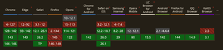
<a href="#" onclick="shareContent(); return false;">Share this page</a>The API has been around since 2017 (Chrome Android), with Safari joining in 2019 and desktop Chrome/Edge in 2021. Today you're looking at 85-90% browser coverage. The main holdout is Firefox desktop - they only support it on Android. A simple "Copy Link" fallback handles the rest.
For full implementation details, check the MDN documentation for navigator.share().
Clean. Native. No external scripts.
Look at how major platforms handle this now. Medium and Dev.to don't splash a row of social icons across their pages. They hide sharing behind a single, recognizable share icon. Click it, and you get options - but it's tucked away, not competing for attention. Under the hood, it's often just opening a new tab with pre-filled text. The Web Share API does this natively and cleaner.
Copy link button
Sometimes the simplest solution is the best. A "Copy Link" button using the Clipboard API gives users exactly what they need without the bloat.
Great content
Here's the real secret: if your content is worth sharing, people will find a way to share it. They'll copy the URL, screenshot it, or send it directly to friends. No share button required.
What I did on FreshJuice
Honestly, FreshJuice never really had traditional share buttons. Well, technically I added them when we launched three years ago, but they didn't last long.
After analyzing click data across my client websites, I realized how useless they were. Picture this: a blog with ~50,000 unique visitors per day was getting literally 10-20 clicks on share buttons per month. That's roughly 1.5 million visitors and maybe 15 clicks. And I'm pretty sure most of those were our own team members being too lazy to write posts manually - they just hit the button for a quick share to social media.
So I removed them from our main build pretty quickly. The result? More useful space on the page, no third-party logos cluttering our design, and faster load times.
What I did recently add is a native share button. You can see it floating on the left side of the content as you scroll. One small button that opens your device's native share menu or copies the link to clipboard. On mobile, it's pinned to the bottom-left corner - out of the way while you read, but there when you need quick access to sharing.
I've set up event tracking to see how much interaction this button gets. Honestly? I doubt it'll see massive usage. But that's not really the point. It looks clean, doesn't interfere with reading, takes up almost no space, and simplifies the user experience for those who do want to share. That's all it needs to do.
A note for HubSpot users
If your blog runs on HubSpot, I strongly recommend disabling Social sharing buttons in your blog settings.
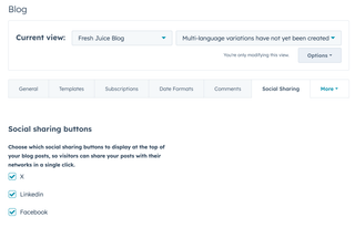
Here's the thing: even if your template doesn't visually display these buttons, having the checkboxes enabled means HubSpot loads a bunch of third-party scripts on every page. These scripts track your visitors and create cookies without their explicit consent - not great in a world of GDPR and CCPA compliance.
Disable them. You get zero benefit from keeping them on, but turning them off makes your site noticeably faster. These "little helpers" seriously hurt page load times and clutter your visitors' cookie storage with tracking data they never asked for.
Conclusion
Check your analytics. Look at how many people actually click your share buttons. I'm willing to bet it's close to zero.
The era of social share buttons is over. Meta said it themselves. AddThis saw it coming. It's time to let go and embrace cleaner, faster, more privacy-respecting alternatives.
Your users will thank you. They just won't click a button to tell you.
May the 4th be with you,
Alex