Your 404 page sucks (and how to fix it)
Most 404 pages are incredibly boring. They smile like Agent K from Men in Black, which is to say, they don't smile at all.
Not only that, but bounce rates on 404 pages typically exceed 80%, significantly impacting overall website performance and damaging your site's reputation in general. For any SEO expert, a 404 page represents shame, but this shame can be transformed into an advantage and convert users into positive vibes.
All 404 pages look alike and appear so ordinary these days that users don't even bother looking for alternative paths or links to valuable resources. They just bounce. Even adding a search bar to the 404 page doesn't help because by that point, you've already lost their attention and trust.
Why common SEO advice fails
Most SEO "experts" recommend adding a prominent link or button to the homepage on 404 pages. In my opinion, this is pointless. When a user lands on a 404 page, they're already disappointed. Their interest has dimmed so much that they'll simply leave in search of alternatives rather than click through to hunt for content on your homepage.
But there's an even worse approach: automatically redirecting all 404 pages to the homepage with a 301 redirect. This makes the user feel caught in a clickbait trap. Instead of the content they were looking for, they're suddenly presented with irrelevant material without any explanation. This bait-and-switch experience creates a negative impression, damaging trust and brand perception.
If you've read similar articles from so-called experts, you'll notice they're all written like carbon copies, offering the same standard advice. However, from my years of experience in SEO and CRO, I can confirm that these seemingly logical suggestions don't work in practice.
Here's the advice you'll find everywhere that simply doesn't deliver results:
Common approaches that don't deliver results
You'll often think that providing users with clear paths forward by including:
- Search bar to find what they were looking for. This is useless because most users have had poor experiences with site searches and don't attempt to use them.
- Links to popular content or sections. Sometimes this works, but more often it doesn't.
- Site map or navigation menu. This is interesting and potentially useful, but not always effective.
- Contact information for help. This is completely useless on 404 pages.
Avoid being boring: brand personality and creativity
Newsletter signup forms are the biggest mistake that all companies make: no one these days subscribes to newsletters to receive spam in their email. Even if someone did want to subscribe to updates, there's no chance they would do so after landing on a 404 page. It's the worst possible moment to ask for an email address.
Other conversion opportunities that have limited effectiveness:
- Links to special offers or promotions. Rarely effective when someone just hit a dead end.
- Call-to-actions for relevant products or services. The timing couldn't be worse for a sales pitch.
- Suggestion of similar content they might be interested in. Hard to guess what they wanted when you don't know why they came.
What I recommend from my years of experience in SEO and CRO
Stop looking at other industry leaders! You won't hear any creativity from them! You won't believe how often in brainstorming sessions I hear: "What are our competitors doing? How are market leaders doing this?" It's okay whether it's good or bad, but we'll copy them, simply because it's an easy way to copy someone.
Looking at competitors for inspiration and ideas isn't shameful, it's necessary. You should study what others are doing to understand the landscape and find inspiration. But simply copying without adding your own creative touch is meaningless.
"Good artists copy, great artists steal." — Pablo Picasso
The key difference is that "stealing" in the creative sense means transforming what you see into something uniquely yours, not just duplicating it.
We all know the Apple effect and how all phone manufacturers try to imitate the famous iPhone. How many such phones can you recall right now? This is indeed a paradox, but I ask you: Why, when a new iPhone comes out, do all Android fans start discussing it and saying how bad it is, claiming they've had that feature for thousands of years? But when a new Android phone comes out, iPhone fans don't even hear about it and don't know about it.
This is all about brand recognizability and uniqueness. People want to see something new and fresh, not another copy of what already exists in the market.
I ask you to STOP PLAYING SAFE AND START BEING CREATIVE! Remember that on the other side of the screen are real people with souls and emotions; that's what gives Apple and other successful brands their magic. You should strive for that. I know I'm being preachy and you might not have read to this point, but believe me, if you want to stand out from the crowd and be noticed, you need to be creative and fun.
Best practices for 404 page design
Let's define what you need to consider to create a good 404 page:
-
Keep users on the site: You must retain users on the page at any cost, but definitely not with boring content. You've already messed up and made an error, so you need to smooth things over.
-
Provide clear explanations: Let users know what happened without technical jargon; remember that people are different and not everyone understands technical language, so you need to be as close to people as possible and explain everything in simple terms.
-
Offer alternative content: Suggest similar pages or popular content, but be smart about it. On large websites with diverse topics, generic "popular posts" rarely match what the user was looking for.
-
Use visual elements: Include images, graphics, or animations to maintain engagement.
-
Play on this awkward situation with jokes and humor: People love when they're treated with humor and lightness, not as robots. Yes, in the end, simply admit your big mistake that it's shameful to have lost content. People like to see that someone else messed up and even more so acknowledged their fault.
What other authors say about 404 pages
While researching this topic, I came across several good articles that inspired some of my thinking. You might notice some overlap in the examples I feature, and that's no coincidence: great 404 pages tend to get noticed.
Here are some worth reading:
- Pagecloud: Best 404 Pages
- Tillison: 404 Pages That Help Reduce Bounce Rate
- HostAdvice: Creative 404 Pages
One thing I noticed though: not all of these authors apply their own advice. Take a look at their 404 pages (Pagecloud, Tillison, HostAdvice) and judge for yourself. HostAdvice actually did a nice job with theirs.
Brands who actually get it right
Enough theory. Let me show you some 404 pages that nail it.
Marvel
Marvel's 404 puts their superheroes front and center. They tied the error message to a specific character, added subtle animations, and here's the genius part: refresh the page and you get a different hero. Simple idea, perfect execution.
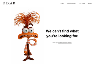
Pixar
Anxiety from "Inside Out 2" explains the error using concepts straight from the movie. Tons of white space, beautiful design, completely on-brand. This is what happens when a creative company actually gets creative with their 404.
Blizzard
Lost in a blizzard? A friendly murloc greets you and helps you find your way home. It's animated, it's cute, and it fits their gaming brand perfectly. Check it out.
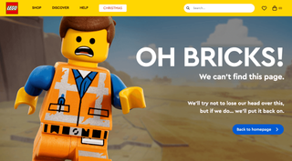
LEGO
Proof that you don't need to overcomplicate things. A picture of a confused LEGO figure, one line of text, and a button to go home. That's it. And it still makes you smile every time.
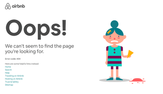
Airbnb
An animated girl drops her ice cream. You feel bad for her. You don't want to leave right away because that wouldn't be nice, right? Emotional manipulation at its finest, and it works.
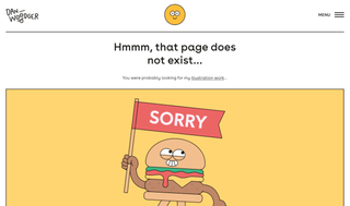
Dan Woodger
This freelance illustrator (whose work you've seen at McDonald's) uses one of his friendly burger characters holding a "sorry" flag. Subtle CTA sends you to check out his other work. He turned a dead end into a portfolio showcase.
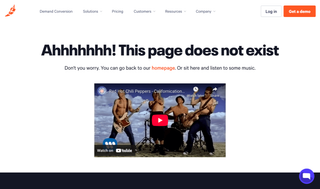
Chili Piper
"Ahhhhhhh! This page does not exist." And then they offer you to sit and listen to some music. Red Hot Chili Peppers, of course. The name pun is obvious, but it works. Sometimes the simplest jokes are the best ones.
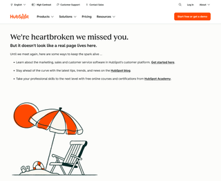
HubSpot
"We're heartbroken we missed you." Classic HubSpot: they turn every touchpoint into a lead nurturing opportunity. Links to their platform, blog, and Academy. Not the most creative, but they stay on-brand and keep you engaged with their content ecosystem.
9GAG
Movement catches attention. 9GAG's 404 uses a simple animated GIF that feels native to their platform. They also sneak in a CTA to download the app. Animated GIFs are relatable, shareable, and make your error page feel less like a dead end.
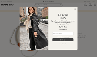
Lands' end
Here's a different approach: exit intent. When you're about to leave their 404 page, a popup offers 40% off full-price items. Aggressive? Maybe. Effective? Absolutely. If you're losing the visitor anyway, why not try to convert them with a discount?
FreshJuice (yes, that's us)
I saved the best for last. Our 404 page picks a random iconic song and rewrites the lyrics to fit the 404 situation. "Never gonna find this page, never gonna load it up..." with an embedded YouTube video right there. Refresh and you get a different band. Green Day today, Rolling Stones tomorrow.
The idea for creative 404 pages came to me about three years ago when I was working closely with Chili Piper, integrating their systems into HubSpot. I accidentally stumbled upon their 404 page and it hooked me instantly. I spent about 10 minutes just sitting there, listening to "Californication" by Red Hot Chili Peppers on repeat.
Inspired by their example, I created my own version at alex.zappa.dev/404, where I played with the lyrics of "Angry" by Rolling Stones and embedded the music video.
Why? Because 404s don't have to be boring. I practice what I preach. Remember: there are real people on the other side of the screen. Make them smile, not bounce.
Technical considerations
Beyond the design elements, consider these technical aspects:
- Ensure 404 pages return the correct HTTP status code
- Don't block 404 pages from search crawlers in robots.txt
- Monitor 404 errors regularly and fix important broken links (only important ones, not everything)
- Use Google Search Console to identify important 404 issues
Measuring success
You absolutely must set up a tracking system on 404 pages (usually I see that people try to exclude any tracking from these pages, which in my opinion is grammatical ignorance). You should measure 404s like all other pages and possibly pay it even the same attention as valuable pages since 404 is a very good opportunity to convert people into customers.
Track these metrics to measure the effectiveness of your improved 404 page:
- Bounce rate on 404 pages (should be significantly below 80%)
- Exit rate from 404 pages
- Pages that users engage with after landing on 404
- Search queries that led to 404 errors
Conclusion
A 404 page doesn't have to be an SEO expert's shame. Instead of accepting boring, high-bounce 404 pages, transform them into opportunities that actually convert.
Remember, every visitor who lands on a 404 page was once interested in your content. Don't let that interest die. Connect with them through humor, own your mistake, and guide them somewhere valuable. That's what separates forgettable websites from memorable brands.
May the 4th be with you,
Alex