Modules
Pricing Cards
Pricing cards introduce a product or service to potential customers. They are used to display pricing information for a product or service.
You can check the demo page here
Single Pricing Card
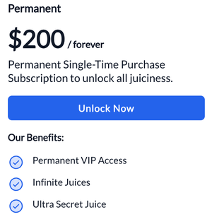
The Single Pricing Card has the following settings:
- Tier Name: The subscription or service name.
- Price: The price of the subscription or service.
- Price Details: Any additional information you may want to add for the price (will be in smaller font).
- Price Subtext: Additional information on pricing or subscription.
- CTA Label: The text for the call-to-action button.
- CTA Link: The link for the call-to-action button. Includes additional settings such as:
- Link to: (internal, external, email address etc.).
- URL: The URL of the page you want to link to.
- Open Link in new window?: (Toggle) Open link in a new tab.
- Link Type: (Toggle) At the moment only option is No Follow, which by default is deactivated.
- Features Title: The title of the features section.
- Features List: A list of features. For each item in features list, you can edit the text of the item.
Pricing Cards
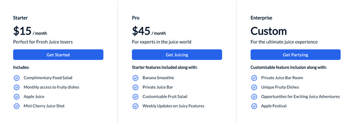
Settings
For each Price Card, you can set the following settings:
- Tier Name: The subscription or service name.
- Price: The price of the subscription or service.
- Price Details: Any additional information you may want to add for the price (will be in smaller font).
- Price Subtext: Additional information on pricing or subscription.
- CTA Label: The text for the call-to-action button.
- CTA Link: The link for the call-to-action button. Includes additional settings such as:
- Link to: (internal, external, email address etc.).
- URL: The URL of the page you want to link to.
- Open link in new window: (Toggle) Open link in a new tab.
- Link Type: (Toggle) At the moment only option is No Follow, which by default is deactivated.
- Features Title: The title of the features section.
- Features List: A list of features. For each item in features list, you can edit the text of the item.
Price Card with Details
Settings
This Price card consists of two sections; Two Column Group and One Column Price Card.
Two Column Group has the following settings:
- Title: The title of the Details Section.
- Description: The description of the Details Section.
- Divider Text: The text that will be displayed in the divider.
- Features List: A list of features. For every item in features list, you can edit the text of the item.
One Column Price Card has the following settings:
- Slogan: The slogan of the Price card.
- Cost: The price of the subscription or service.
- Cost Details: Any additional information you may want to add for the price (will be in smaller font).
- CTA Link: The link for the call-to-action button. Includes additional settings such as:
- Link to: (internal, external, email address etc.).
- URL: The URL of the page you want to link to.
- Open in New Tab: (Toggle) Open link in a new tab.
- Link Type: (Toggle) At the moment only option is No Follow, which by default is deactivated.
- CTA Text: The text for the call-to-action button.
- Sub Text: The title of the features section.
Feeling inspired? Squeeze more juice out of FreshJuice in the Knowledge Base, with premium Pro Modules and extras.