Modules
Card

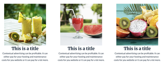
The Card module is a simple module that allows you to create a three column grid with text.
You can check the demo page here
Module Settings
- Card: A list of cards. You may add as many as you want. Every card has the following settings:
- Image: Image for your card. By default, there is no image.
- Content: Rich text that you may customise as you see fit.
Styles Settings
All the style settings for this module are for alignment purposes.
- Horizontal: Aligns the image in the card to the left, right or center of the container.
- Align Text: Aligns the text in the card to the left, center, right or centralised (when not aligned neither left or right but fills the space provided).